Tasks lie.
Effort does not.
Your strategy declares what matters.
Are your top priorities actually getting funded?
DreamEffort scores misalignment by priority weight: a 5% gap on your #1 initiative shows differently than the same gap on your #5. Real activity. No timesheets. No estimates.
Three questions you can't answer fast.
When 4 initiatives slip at once, which one hurts most? You don't know — slips aren't all equal weight.
Where is your team actually spending time vs. what you declared as priority? Status reports won't tell you.
Are your underfunded #1 priorities staying that way? You'll find out at the quarterly review — too late.
The only way to answer these today: Excel, manual rollups, and hope the data is still fresh.
DreamEffort shows you where effort actually goes — and which gap hurts most.
Effort, distributed
See how engineering investment distributes across your priorities — fresh every morning, not last quarter.
Priority-weighted gaps
See which misalignment hurts most — slips weighted by your priority order, not by absolute size.
Spot underfunding
Spot underfunded initiatives before the quarter is over.
Staffing recommendations
Who's available, what they specialize in, why they fit.
Nothing changes for your team.
Three steps. Zero disruption.
Connect
Link your planning and activity tools. Read-only access.
Collect
Every commit traced back to your strategic priorities. Automatically.
See
Effort distribution, alignment gaps, and staffing recommendations — updated daily.
No timesheets. Just observed reality.
DreamEffort reads what already happens in your tools.
Commits
Automatically linked to the work they served — using the references your team already puts in commit messages.
Scope changes
Tracked over time — every change to what's in scope, not just today's snapshot.
Specialties
Inferred from where people actually wrote code — not declared skills, not a static profile.
Your engineers do nothing different. We refresh nightly — fresh signals every morning, not yet another dashboard begging for attention.
Declared vs. Actual — at a glance.
The Strategy page shows whether your investment matches your intent.
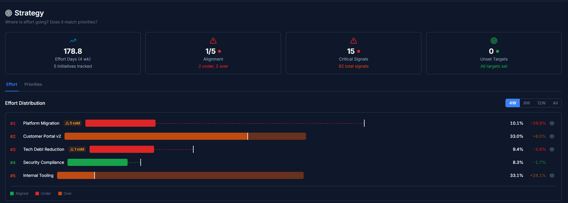
Effort distribution — declared vs. actual investment, color-coded by alignment
Problems surface themselves.
Stale work. Capacity gaps. Delivery risk. Detected automatically from real activity — and ranked by your priority order, not by "highest severity wins."
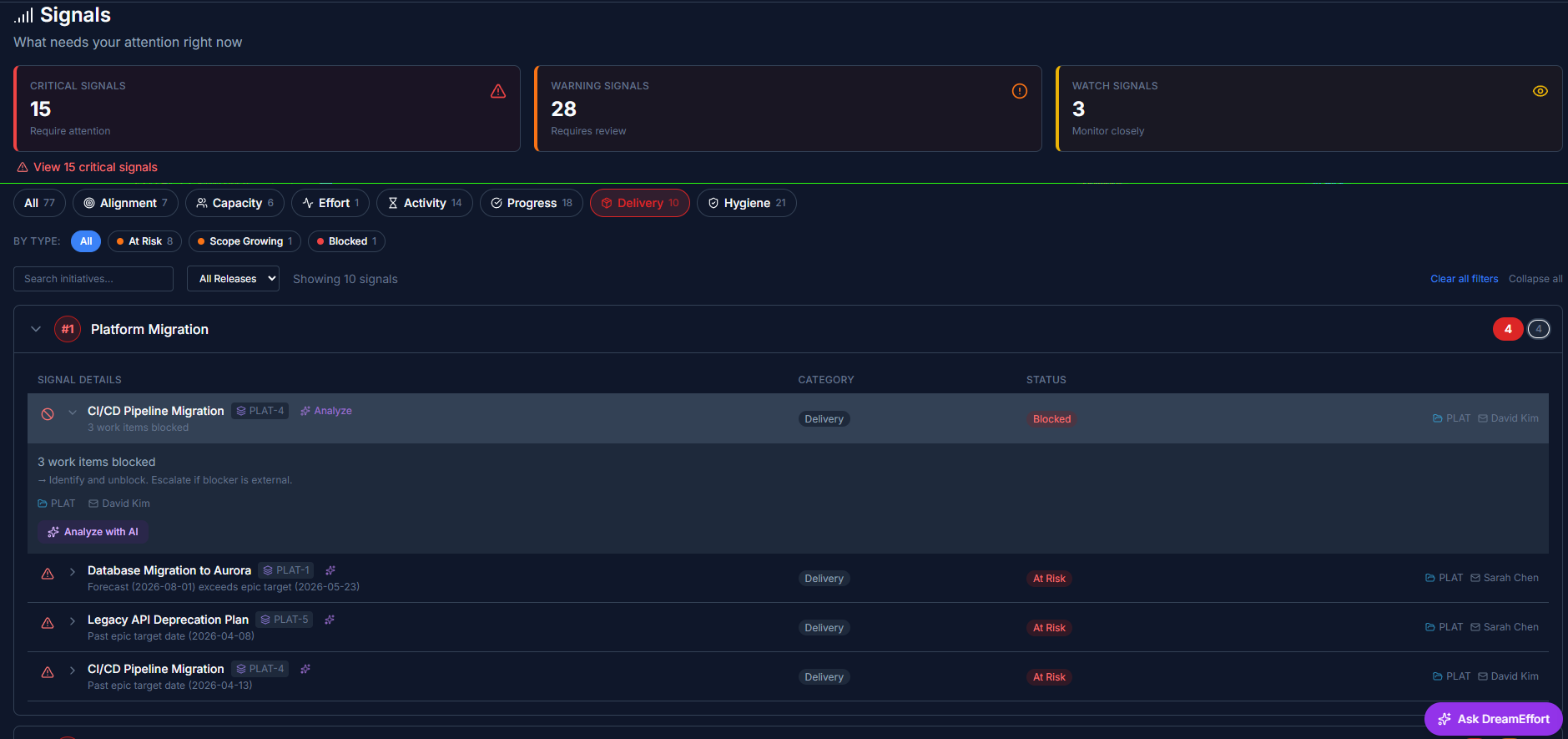
Signals page — collapsed view, severity pills + priority badges
See where your effort really goes.
Explore the live demo with sample data. No signup required.